It’s well documented that first impressions count, and if you’re a new artist that wants people to listen to your album, they really, really count. These days it’s unlikely that someone will spot your record in a shop and buy it on a whim, based on nothing but its captivating artwork, but that little image could grab their attention on Spotify or Bandcamp and bring you some new listeners.
Here are some dos and don’ts for when it comes to designing your album cover, complete with some handy examples.
DO:
Try to represent the music on the album
Remember this is the first impression your album will have on anyone, so it needs to be memorable and it needs to express everything that your album expresses. If your album is wall-to-wall drum and bass, then a landscape oil-painting might not send across the right signals, while a colourful jazz record might want to avoid a minimalist design.
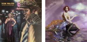
Check out this Tom Waits album cover, if you haven’t heard the album it’s pretty easy to tell its full of seedy, melancholic songs. Have a look at SOPHIE’s new album however and you’d never guess it was full of some of the most chaotic electronic music of the year.
Aim for your audience
Think about the kind of person who will listen to your album, and then think about what might catch their eye. A folkie might look for a moody portrait picture, a techno fan will gravitate towards minimalist logos and metalheads will be looking out for black covers and graphic imagery. Know who likes your music, and know what they’re looking for.
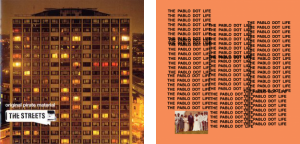
The Streets‘ debut Original Pirate Material was a melting pot of urban musical styles, and its iconic artwork certainly targets an urban audience. When you’re Kanye West it doesn’t really matter what your album looks like, people are going to listen to it. But if The Life Of Pablo wasn’t a Kanye album, it’s hard to imagine a hip-hop fan taking any interest in it based on this garish cover.
Try to influence the listener
It’s impossible to control what people hear when they listen to your music, but your best bet at giving them some context is through the artwork. You can use colours, imagery and typefaces to try and give listeners a certain feeling or visualise a particular setting.
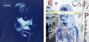
The cover of Joni Mitchell‘s Blue is likely to make you feel a bit, well… blue, but looking at the cover of Red Hot Chili Peppers’ By The Way isn’t likely to do much for you, and definitely won’t be enhancing your listening experience.
DON’T:
Use Random Images
If you’re not careful with the images you use, you could well land yourself in hot water. Vampire Weekend used a random image from the internet as the cover of their 2010 album Contra and were subsequently sued by the woman in the picture, resulting in an out of court settlement.
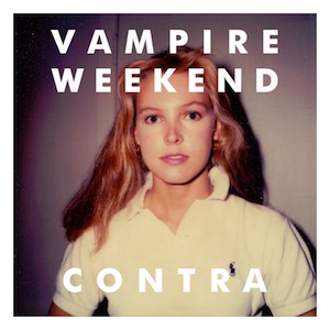
Always check where your images are coming from, and find out if you need permission to use them. It might be safer to stick to using your own images.
Use something boring
Minimalism will be forever cool, but there’s a fine line between keeping things simple and looking like you’ve made your album cover on Microsoft Paint in five minutes. Using something basic will only work if it matches your music and your overall style as an artist.

R.E.M. may have been a fantastic band, but they’ve had more than a few terrible album covers. One of their worst offending (and bestselling) records is Out Of Time – which is probably a very appropriate way to describe the artwork designer on deadline day. On the other hand, The xx‘s debut LP xx boasts a bold and instantly recognisable cover that could easily have been made on Microsoft Paint in five minutes. The difference is it does exactly what it needs to do, whereas the R.E.M. cover comes across as cheap and undercooked.
Date your album
When you release your album, it’s out there forever – so you want it to age well. Try to avoid using styles and items on your album cover that will make it look dated in the future – fashion and technology go out of style very quickly and can make something look naff.
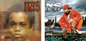
Have a look at these two Nas albums. They’re both great, but you’ve probably only listened to one of them. Have a think what might have stopped you listening to the other… Neither of them sound dated, yet Illmatic looks timeless whereas Stillmatic looks a little out of touch.